Promosykkel.no – 2006
The Challenge
Having just launched a new sister company the client wanted a second website to showcase the new product. To establish their identity the new website was to be similar to their main company website, yet slightly different.
Furthermore, they wanted the website to immediately reflect what they where offering which resulted in the need for a very creative logo.
The Solution
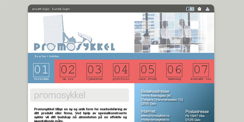
The overall design was kept exactly like the mother site, the only main difference is the change of colour in the top menu. Besides the descriptive logo several action shots were added on the right sidebar to further illustrate who the “merchandise” will be of benefit to potential customers.
Apparent connection with the clients main website was established through several links both on top and at the bottom of each page. Furthermore, keeping a uniform layout also made swapping back and forth a simple and intuitive task as the navigation and overall appearance stays the same.
