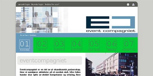
Eventcompagniet.no – Version 2 – 2006
The Challenge
Having worked closely with Eventcompagniet on several previous projects I know they understand the importance of keeping a “fresh” appearance. Thus, they wanted yet another redesign done for their company website.
In short, what they wanted was an easy navigable business looking website that would stand out from the crowd. Being the second major redesign, they also wanted to implement tools for smooth interaction with their clients.
The Solution

We created the site using the standard business colours, blue and grey, and added some green to give it a healthy environmental feeling. Company photos, slightly “Photoshopped”, was added to the right side to live it up a little. The massive main menu made navigation dead simple and also added to the uniqueness factor.
The website consists of several forms and also links to their report site and sister company. The company has recently been bought and we are currently planning a new and site-wide update/redesign. Watch the Journal for more news on this subject.
