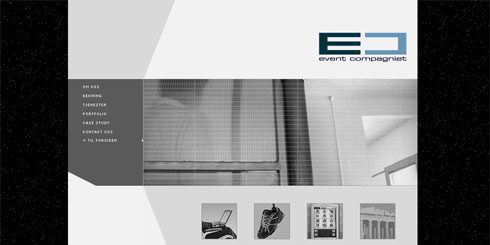
Eventcompagniet.no – Version 1
The Challenge
The client wanted to redesign their current website to give it a unique and attractive design that would look “big” even with very little information revealed.
They also wanted a section to showcase their latest projects and press releases along with national/international business awards.
The Solution

We created a black and white themed website using large graphics and strong focus on company branding. PHP, HTML templates and some JavaScript made the foundation which initially also allowed for separate themes based on time of day. However, the client loved the “natt” (night) version so much they decided to stick with just one look.
Over the years Eventcompagniet has been a loyal client. After the initial release I’ve redesigned their main company website not only once but twice. I’ve also been their main developer on various other projects. Watch the Journal for more news and updates on this subject.
